Monday, October 31, 2011

Progress

This past week, I exposed all my photolitho plates for my panorama and I was able to print 2 editions of this print:
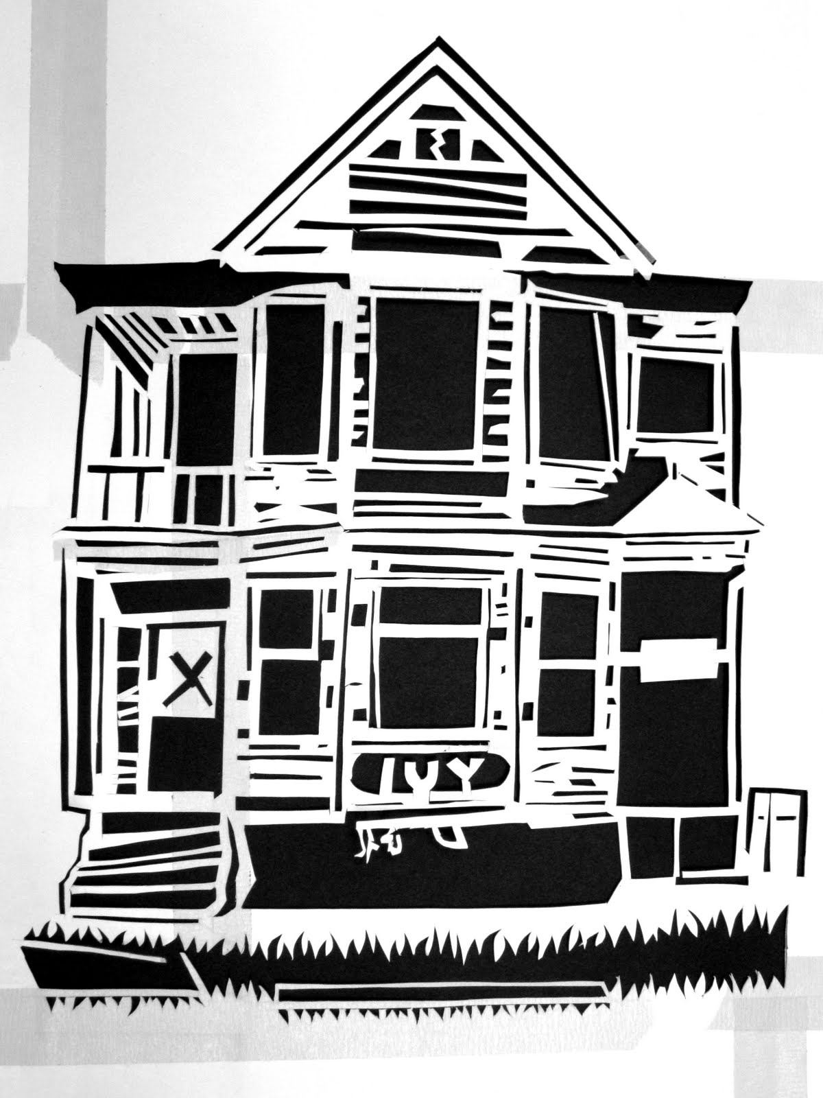
They were printed on Masa paper. The problem with photolitho is that they don't ink up quite as quickly as drawing litho plates - and if the ink is to thin certain areas fill in too fast. So I think this is a pretty bad print because there is way too much contrast and some of the delicate values did not come out.

I'm going to be printing on Okawara which is a better paper. I'm hoping it picks up more detail.

This week I'm planning on layering a lino relief in the background before my final printing (thanks for the suggestion Sam Levy!!)


Progress

So this past week in IP I began working on individual drawings, which (as I discussed in my meeting) are coming along a bit slow as I try to make all of my drawings look like they exist in the same world/ book. I am getting quicker, and my goal is to have half of the spreads done by the next post. For this zine I am choosing to do everything on an isometric grid, and use both close ups (to get the gritty detail) and distant 'shots' to make things a bit more dynamic.
In terms of purchases: ALL IS WELL. Screens are in (my hometown, so they have to be driven here), I have all the tools for exposing, plenty of extender and I picked up big containers of process yellow, cyan and magenta this morning. I've also got a sample of hot pink that I'll probably use in a poster or five. Everything is ready to go, aside from illustrations and the paper, which I am avoiding dealing with because it is so damn expensive. I also have to get back to finding where/how the hell I'm going to pull of this shop thing.


First spread. That blue diagonal line is going to be a road with a smashed car and a dead deer on it, lovely. Excuse the color testing things.

This is what I was talking about with the whole 'getting my animals to look the same' thing. I made this and decided it looked nothing like anything else. Maybe I'll give it to someone who likes Ed Hardy.

This is a better drawing of a tiger. These will look different at the end of this week (put 'em on an isometric grid, make them more interesting/ gory).

Sunday, October 30, 2011

Maria Arambula


Progress Oct 30th- Teresa Dennis

I finalized my character designs! Here they are:

Also, my Reaper sculpture was fired in the oven and was successful, no cracks or burns on it, wewt


The storyboard is chugging along, this is a picture of it earlier, I will put a updated picture i this post tomorrow

UPDATED:


Character Beginning

So, this week I had a wonderful realization that my character was actually an important part of the piece.  And I realized that I hadn't rigged a character before.  So, below is a very amateur screenshot of what I'm working on.  No, it's not a chicken leg, just figuring out how to do this in 3D. (I think if you click on the image below you can see it animated)


Basically, I need my main character (Gus) to be in different positions and have different facial emotions.  So, this week and probably next will be spent modeling him and getting him integrated with the style.  Because of my lack of skill in animating a character in 3D, I will most likely have to scale back what you see Gus doing as far as movement on screen.  e.g., instead of seeing Gus  physically moving down a ladder, he would be in place kind of frozen and other scene elements would be moving.

I'm very much aware of the fact that character animation takes years to perfect, which is why I wanted the entire project to be more like a storybook instead of a full out animation.  Therefore, we should still be on track.

5 images and progress


For the inspiration of prototype, I looked at some Korean traditional patterns and Yves Klein's works. The bottom one is my prototype work, half-sized of real one. Here, I put a traditional pattern of grape vine. Through this work, I could find some defects to be considered. The acrylic paint became darker and some patterns got cracked as they dried. And pouring acrylic medium that I used for gloss effect did not work as I thought. Next week, I will try to solve these problems. Also, I plan to design 20 paintings and start to stretch canvases.

concrete pour. concrete mess. concrete fail

This past week has been very productive and yet very unproductive at the same time. I finished making my mold and did my concrete pour. The pour went well however because the wood plugs expanded while the concrete shrank it made getting the plus out of the mold near impossible. While attempting to take the plus out I actually hammered the base of the T joint a weak joint to begin with) right off. Now the table doesn’t stand on a the center T. (a decision that was made soley on visual preferences and clearly caused alot of problems from the get go) In addition, another pour cannot be done directly on that joint to repair it because that joint is now forever weak. So back to the drawing board. I have been thinking about incorporating steel into the legs to take care of the structural issues that the concrete inherently creates and I can learn how to weld! Here are soem process images of the pour/and fail.

image

image

image

Thursday, October 27, 2011

5 Inspirations- Teresa Dennis

The Five most prominent (and recent) inspirations for my work:

 
Alphonse Mucha
Elegant characters and backgrounds, basic colors turned into a sophisticated visual.

 
Henry Darger
A "closet" artist, who created from his own mind and for no one but himself. He often portrayed figures of innocence fighting against figures of darkness.

Katy Perry 
Attention paid to the movement of Katy as an alien and the use of deep saturated colors

Skrillex 
The song and use of visuals to convey a story, although the vocals and visuals are irrelevant to each other. The artist used tempo and feel of the song to accentuate the video


Beyonce 
Power given to the main (and only) character, the flow of things overlapping each other and again, deep saturated colors

5 Inspiration

Most of the artists that I have been looking towards for inspiration tend to contain animals, play on the idea of cute or cliche, or have a comedic element.


Dave Eggers-Illustrator


Josh Keyes-Painter


Tom Huck-Printmaker (Woodblock)


Ralph Steadman-Illustrator


Barnaby Barford-Sculpture


Wednesday, October 26, 2011

Studio Progress 10/26

Alright, so this is super late, but I figured I'd just post it anyway. The tasks I've been devoting my time to lately include: acquiring fabric, sorting fabric, getting more familiar with my sewing machine, and making my prototype. Here's my fabric stash so far.


I decided that working with color gradients in my art quilts was one technique I wanted to use, so I figured I would base my prototype on this. For my prototype, I wanted to make a mini-quilt, so I could become more familiar with the various steps involved in actually putting together a large one. Below is my miniature "quilt sandwich" of the top layer, batting, and backing before I actually quilted it.

Here it is again after being quilted. I decided to quilt it in a way that I hoped would emphasize the geometric lines already in play.

And the back...


Elyse Shapiro- Studio Update (Oct 26)


In my studio this week, I have been spending a great deal of time carving my stencil. I am working to give each house an individualistic texture and look unique onto its neighbor. Of these homes, I have carved 4 and have 3 to go. After the houses are complete, I am going to carve the areas between them (trees and grass), and then carve the street which parallels the outer layer's imagery.

Here I have began to include imagery of trash and discard of the area surrounding the houses. This imagery will continue between the home and neighbor and will change by location.
This is the only occupied home on the "street," insinuating that not all hope is lost.
Here is another example of the street imagery's initial add-in. This vacant home has bottles and cups on the lawn.

This week, I have also began to work on collecting my materials such as the polyester material, mylar for drawing, metal for lamp structure, color transfer paper, and pigment paints for printing. I have began to create the model for the physical lamp itself, and the following is the diagram I am working on.

Tuesday, October 25, 2011

Progress Oct. 18-25

This is a model I sewed to understand the construction of my first pillow before creating the final piece. I discovered that I should place velcrow on the bottom of each pillow for the purpose of being able to open the pillow in order to stuff it to form the shape. I felt velcrow would create a more clean look instead of a simple hand sewn stitch. Over all, the sewing process was fairly simple. The most difficult part was making sure each shape was symetrical:


Through various psychology readings, I designed my third pattern. It will be scribbled lines much like the image below. These lines represent axon terminals found in the REM sleep-triggering region of the brain. The axon terminals have synaptic contacts with the medullary formation of cells that send signals to the motor nucleus. I wanted to create designs that would visually represent scientific explanations of what occurs in the human mind while asleep. I thought it would be interesting to contrast science with my own subconscious thoughts:

http://research.vet.upenn.edu/tabid/2887/Default.aspx


This is a new pattern I created in illustrator for the center of helicopter propeller. It will take 4 screens to complete this design. The design is based on the same dream as the tornado. This particular square pattern I recall seeing in a pizza restaurant I visited the dream:


Continued working on tornado print for the wings of propeller design.